Advocate Healthcare
Advocate Healthcare
Physician Data Analytics
Physician Data Analytics
ROLE
ROLE
Lead Designer, Researcher
Lead Designer, Researcher
Advocate is the largest health system in Illinois, employing over 35,000 associates, including 6,300 physicians and 11,000 nurses across 400 sites.
Over 8 months, we built a tool that would create shared understanding and spark meaningful conversation around performance metrics between Physicians, and Advocate Administrators. The efforts came in advance of a new bill that would change how Medicare compensates healthcare providers on quantitative metrics indicative of value delivered to patients. Through my work, I learned to truly appreciate what it takes to spark large-scale change in an industry that has long-held norms and practices.
Since this is a longer case study, I've bumped some final visuals to the top. Read on for more details on my design process, which included user interviews, usability testing, and interaction design.
Advocate is the largest health system in Illinois, employing over 35,000 associates, including 6,300 physicians and 11,000 nurses across 400 sites.
Over 8 months, we built a tool that would create shared understanding and spark meaningful conversation around performance metrics between Physicians, and Advocate Administrators. The efforts came in advance of a new bill that would change how Medicare compensates healthcare providers on quantitative metrics indicative of value delivered to patients.
Since this is a longer case study, let's start with the final visuals, and you can read on for more details on my design process, which included user interviews, and conceptual and detailed design.
Physician
Physician


Administrator
Administrator


Design Process
Design Process

One of our stakeholder interviews; this one in a larger group format.
Challenges
Physicians are highly critical about any data they see. They have been trained for years to interpret both qualitative and quantitative data presented to them as they diagnose and treat their patients. Their bias towards thinking their population is always sicker than others can also make them discredit quantitatve data when presented.
Experienced doctors comprised a large user segement and they are naturally resistant to change. We had an uphill battle with trust and adoption from the start.
We aimed to form trust by delivering performance metrics that were easy to understand, personally relevant, and not dismimssive of their real-world qualitative experience.
Meanwhile, our other users - Administrators placed a demand on the tool to move macro to micro views as they drive to improve quality of care across sites, departments, and other groups.
Interviews
We spent considerable time interviewing the Administrative stakeholders and users. Since many of them were once practicing physicians, or work directly with them, they served as an excellent proxy.
From our interviews we identified themes and established guiding design principles that would be referenced throughout the remainder of the project.
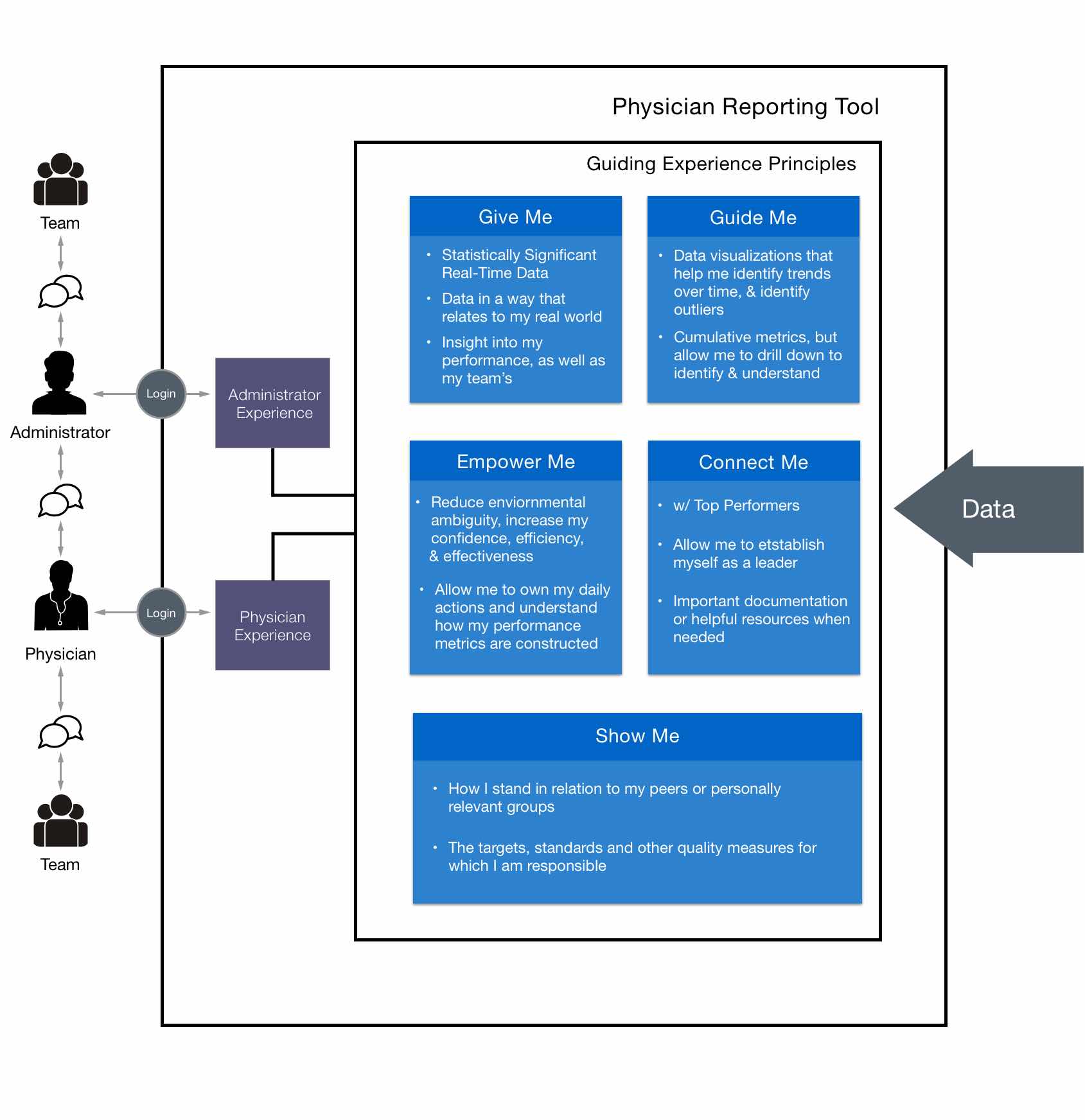
Our guiding experience principles helped align the conceptual vision of what the tool would allow our users accomplish. More than anything, the tool aimed not to be oppressive, but instead facilitate a greater dialogue between physicians, administrators, and their teams in support of improving overall performance.
For Physicians and Administrators, we identified there was a strong social need to be able to compare performance against that of relevant peer groups.
As we continued to interview our two end-user groups, we were able to pull together common themes into working high-level personas.


Conceptual Design
Starting the Conversation
With our guiding experience principles in hand, we led with multiple rounds of conceptual mocks to drive the conversation and push through ambiguity.
Initially, we pitched modules that specifically addressed each principle, but we would learn that this was overwhelming. The users needed to be able to access the tool about once a month, and quickly understand how they're doing and what needs attention, while also providing a more detailed drill down view.
The central challenge in the UI design became finding the right balance between macro and micro data, while supporting navigation and comprehension.


Breaking New Ground
Breaking New Ground
After multiple rounds of conversation-provoking mocks, we completely redesigned our approach and arrived at what could then officially refer to as our starting point. This resulted in:
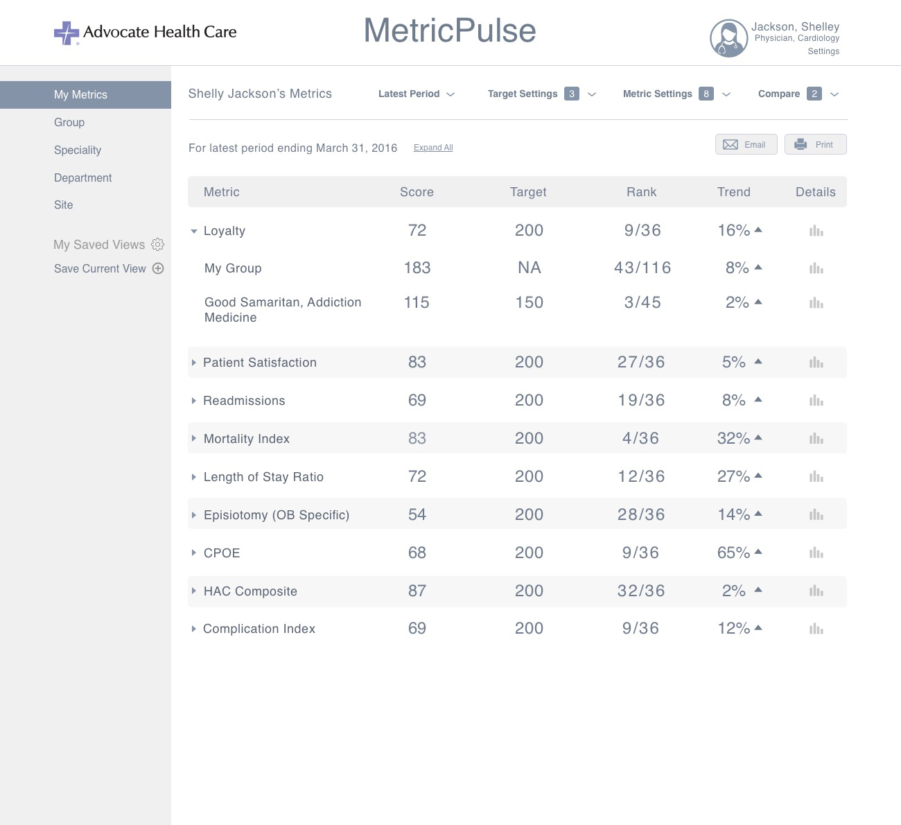
- Performance merics being listed in straightforward rows, containing nothing more than the essentials.
- The ability to quickly see only metrics that were on target, or under target.
- Metric definitions to aide comprehension, and trust.
- Navigation premitting quick switchest between personal and peer group views.
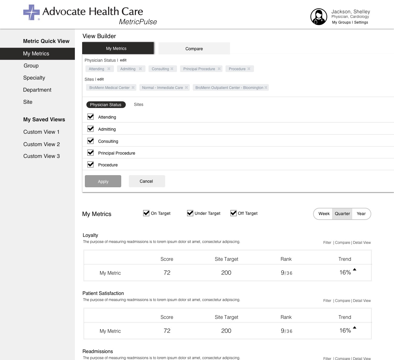
- Advanced filters, called a "View Builder", which would enable modification of the data samples. This would be a central feature going forward since factors such as "Physician Status" add a huge degree of context.
- The ability to build their own custom comparison against any group or entity permitted.
It was decided due to various constraints that we would exclusively focus on designing for desktop and tablet form factors. Designs for mobile are underway as of November 2017.


Pushing it farther
We kept iterating for multiple rounds to a point where the client and our team thought we had evolved it as much as we could before putting it in front of users. These iterations resulted in:
- Consolidation of the top level metrics into a table format to support quicker scanning and consumption of data.
- New filters around time and target, and complete redesign of our the two more complicated filtering views -
- "Chrome" Round-up - We merged all of the various filters together into a single area that acted as a "roof" on all the metrics beneath it. We suspected this would be an improvement since it would centralize everything. Yet, we wondered if the dropdown filters would negatively impact discoverability. We added counters next to the filter names to counteract this.
- Metric drill-down views - We designed for how a user could drill-down into a deeper view and view trends over time, and even patient cases that contributed to their score. The visualizations were simple placeholders as the data platform was TBD.

There were many possibilities of how the Providers and Administrators could view the metric comparisons through relevant groupings. Pictured above is some of our work to arrive at the right viewing permissions for both user groups.
Some of our work to arrive at the right viewing permissions for both user groups.


Usability Testing
The time had come to get some real user feedback on our designs. With the help of the Advocate team, we recruited 7 test participants for our first round of usabililty testing.
Each session lasted 30 minutes, enough time for an introduction and explanation of the agenda, to administer the test, and additional interview and discussion. Audio was recorded to capture the participant's "think-aloud" verbalizations and the discussions, along with a screen capture.

A moment from round 2 of our usability testing (Physician participant not in frame)
A moment from round 2 of our usability testing (Physician participant not in frame)

Findings
Findings

We took diligent notes of the particpants actions, successess, failures, and reactions as they worked with the tasks. We followed up with both open ended questions along with specific questions about certain moments that stuck out. The session concluded with a System Usability Survey. Our key findings were as follows.
Physician Comparisons - Physicians will not need the ability to create granular comparisons of their own scores against entities outside of their own personally relevant sphere.
Drilling Down - There needs to be an easier way to drill down to the second level of data, as they tried unexpected methods. The task that tested this was widely failed.
Enhanced Metric Definition - Participants wanted to see more definition around the metrics and scores. Better communication needed on if trend up is bad or good, what ‘Target’ means and how it is determined, N size, and whether their scores are good or bad.
Surfacing comparisons to peers - They should be more immediately presented and discoverable.
Metric Settings Label - ‘Metric Settings’ is not an effective title for that filter. It contains filters that are more specific to the individual, and it was confusing to the participants. Better discoverability needed for understanding what settings have already been applied.
Metrics vs. Scores - Individual Physicians will want to see the actual metric, rather than a graded score based on a metric which may not hold as much meaning to them.
Detailed Design
Physician
The insight that Physicians do not care to create elaborate comparisons against groups outside of their personally relevant sphere, paired with the desire to have those comparisons immediately presented were huge.
Now, we we could simply present their comparisons by default without the user having to interact with the complex comparison filters. Comparisons would be tucked under their personal metric and accessible with a single tap on the chevron.


Is a high score good or bad? What is the length of the timeframe from which data was collected? How statistically significant is my result? We answered these questions through interaction states that provided the desired info in straightforward language.


The filters evolved over multiple iterations as we moved away from more complex capabilities. Dual-purpose dropdowns were broken down into their singular components. We showed the name of the active selection instead of a more categorical name when possible. This was intended to help Physicians better understand the boundaries of the data.


One concept that gained some traction was the idea of a "Metric Health" indicator that would quickly communicate if their score was good, bad, or somewhere in between. This had to be designed with a great degree of sensitivity, since we did not want the metric to over-simplify the nuance of the data.
The Metric Health indicator couldn't come across as too authoritative. The first incarnation was a "meter" of sorts, and then we then experimented with a combination of shapes and colors. We'd continue to fine tune this feature within our visual design phase.


Administrator
Designing for the administrators was a bit easier since some them were on our team. The main challenge here was how we could extend the patterns we had established for the Physicians for an audience that would need to view the data through a different lens.


We learned that Administrators would need to view the same metrics, but at much greater breadth and depth. They needed to see the metric scores for entire hospitals, and move between additional layers such as departments, specialties, and groups until they ultimately zoomed into the individual physician contributors.
The Administrators also needed to make global changes to the reporting timeframe, physician types, and roles. For the sake of clarity we decided to constrain the viewing metrics exclusively between departments, specialties, and groups.
We did some quick guerilla usability testing in the client's lunch room on a few different designs that would support the constraint. A traditional tab pattern to flip between departments, specialties, and groups won.


ProviderPulse
At the onset of the design I had created the placeholder product name of "MetricPulse", on somewhat of a whim. It had quickly came to mind as I felt that it captured the essence of what we were doing, which was helping Physicians "keep a pulse" on their metrics; with the obvious nod to a vital sign. Towards the end of our long detailed design phase, the client team came up with around 20 different names and started to narrow it down to what they liked best.
It turned out that there was something to that placeholder name. "Metric" was tweaked to "Provider", and ProviderPulse was born!
Visual Design
After a lenghty detailed design phase for what would be our MVP, a visual designer was brought on to create a branded identity and do some fine tuning. During this time additional revisions were made to the Metric Health Indicator, and some interaction signifiers.
The data visualizations on the drill down screen were still placeholders. Unfortunately, we were still handcuffed due to some backend technical matters were still being worked out. Despite our continued emphasis on the importance of taking time to focus on them, we would have to wait.
Next Steps & Reflection
There were some challenges with the data architecture and organizational timing that led to delays in launching this product. However, as of Q4 2017, those hurdles have been cleared and we are full-steam ahead for a Q1 2018 launch.
ProviderPulse is positioned to make a significant impact for Advocate's 6,300 Physicians. Many are looking forward to having greater transparency around their own metrics. We remain excited that ProviderPulse promises to empower Physicians and Administrators to make decisions that improve the quality of care for their millions of patients.
I have since moved on to other work but remain on the project in a leadership capacity, providing assistance to two designers that have taken on the remaining work, which includes designing for mobile.
This project helped me truly appreciate what it takes to spark large-scale change in an industry that has long-held norms and practices. Even more so, it made me more closely understand the obstacles to innovation that exist within our Healthcare system. ProviderPulse represents a step in a new direction, and it felt good to be an integral part of driving that change.
Keep Going

Project EdisonPublic Safety Platform

American AirlinesFleet Maintenance

IntelRetail Sensor Platform

Indy Motor SpeedwayRace Day Fan Experience

Advocate HealthcarePhysician Data Analytics

Global Engine ManufacturerConnected Device Service Design